Industry
E-Commerce / Custom Apparel / Print-On-Demand
Client
Custom Ink
Making Complex Pricing Systems Easier to Understand and Act On
Overview
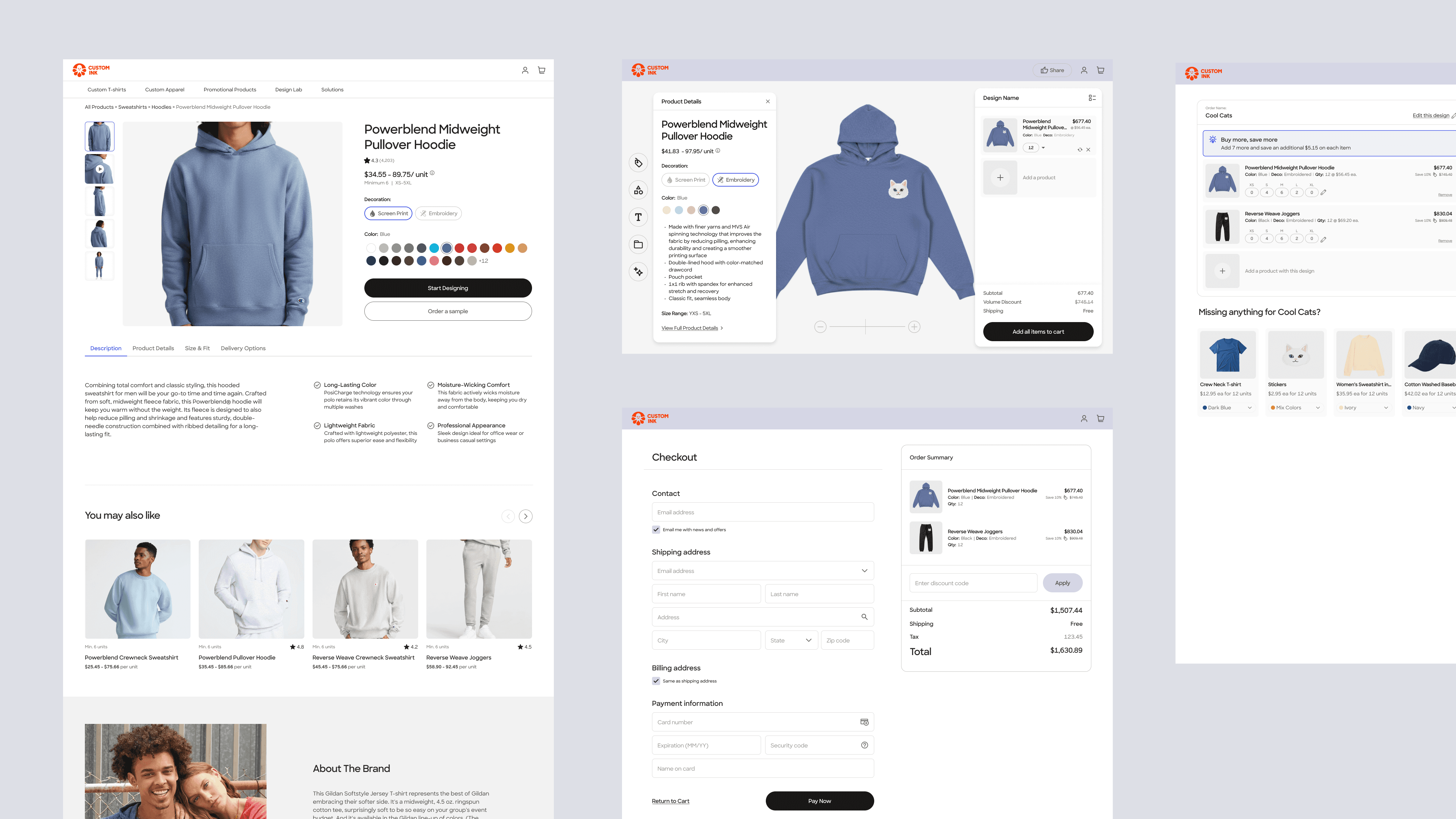
Custom Ink’s purchasing experience sat on top of a deeply complex pricing and production system. Customers needed to make decisions involving garments, decoration methods, quantities, deadlines, and budgets — while the underlying pricing logic continuously shifted based on manufacturing and operational constraints. I led design across multiple pricing and conversion initiatives, helping translate complex business rules into experiences customers could understand, trust, and confidently move forward with. The work spanned onboarding, pricing transparency, product recommendations, customization workflows, and checkout optimization across a funnel serving more than 250,000 users daily and influencing approximately $1.8M in daily revenue.
My Role
Senior Product Designer embedded across multiple commerce and experimentation workstreams. Responsibilities included:
Led end-to-end product design across pricing and conversion initiatives, helping translate complex pricing logic, operational constraints, and business goals into customer experiences that felt clearer and easier to navigate.
Partnered closely with product, engineering, analytics, merchandising, and business stakeholders to understand how manufacturing constraints, recommendation systems, pricing behavior, and customer decision-making interacted throughout the purchasing journey.
Conducted funnel analysis, usability testing, session review, and behavioral research to identify where customers lost confidence, encountered friction, or struggled to understand system behavior within customization and purchasing flows.
Designed interaction patterns, workflows, and system states that clarified pricing relationships, reduced ambiguity, surfaced recommendations more transparently, and helped customers understand tradeoffs before making decisions.
Explored and validated solutions through rapid prototyping, experimentation, and iterative testing, while collaborating through implementation and QA to ensure complex pricing and recommendation logic translated accurately into the shipped experience.


Customers were expected to make confident purchasing decisions inside a pricing system shaped by backend production logic rather than natural shopping behavior.
The Problem
At first glance, the challenge appeared to be conversion optimization. In reality, the deeper issue was comprehension. Research and funnel analysis consistently revealed the same pattern. Customers weren’t necessarily rejecting the product. They were hesitating because they lacked confidence in what was happening. Common friction points included: • Price changes that felt disconnected from customer actions or visible pricing controls • Difficulty understanding what factors affected cost • Uncertainty around recommended products • Confusion when inventory or decoration constraints appeared • Inability to compare tradeoffs clearly • Loss of confidence when flows behaved unexpectedly The challenge became less about persuasion and more about helping users understand the system well enough to make decisions confidently.
Understanding the System

Approach
Research: What Customers Were Actually Experiencing
I ran usability sessions on the existing quote flow with a specific hypothesis: customers weren't abandoning because the price was wrong — they were abandoning because they couldn't understand how the price was calculated or how to change it.
The sessions confirmed it. Across participants, the consistent pattern was:
Customers could not predict what action would affect their price before taking it
When prices shifted, customers attributed it to error, or worse — a manipulative pricing strategy
Recommendation surfaces felt promotional rather than helpful, reducing trust
Inventory and decoration constraint messages felt like penalties, not guidance
The key finding that reframed the entire project: customers who understood the pricing system, even partially, were significantly more likely to continue. The problem wasn't the price — it was the black box.
The Design Direction: From Transactional to Decision-Support
I reframed the work around a single question: what does a customer need to understand in order to move forward confidently?
That shift — from reducing steps to reducing ambiguity — drove every design decision.
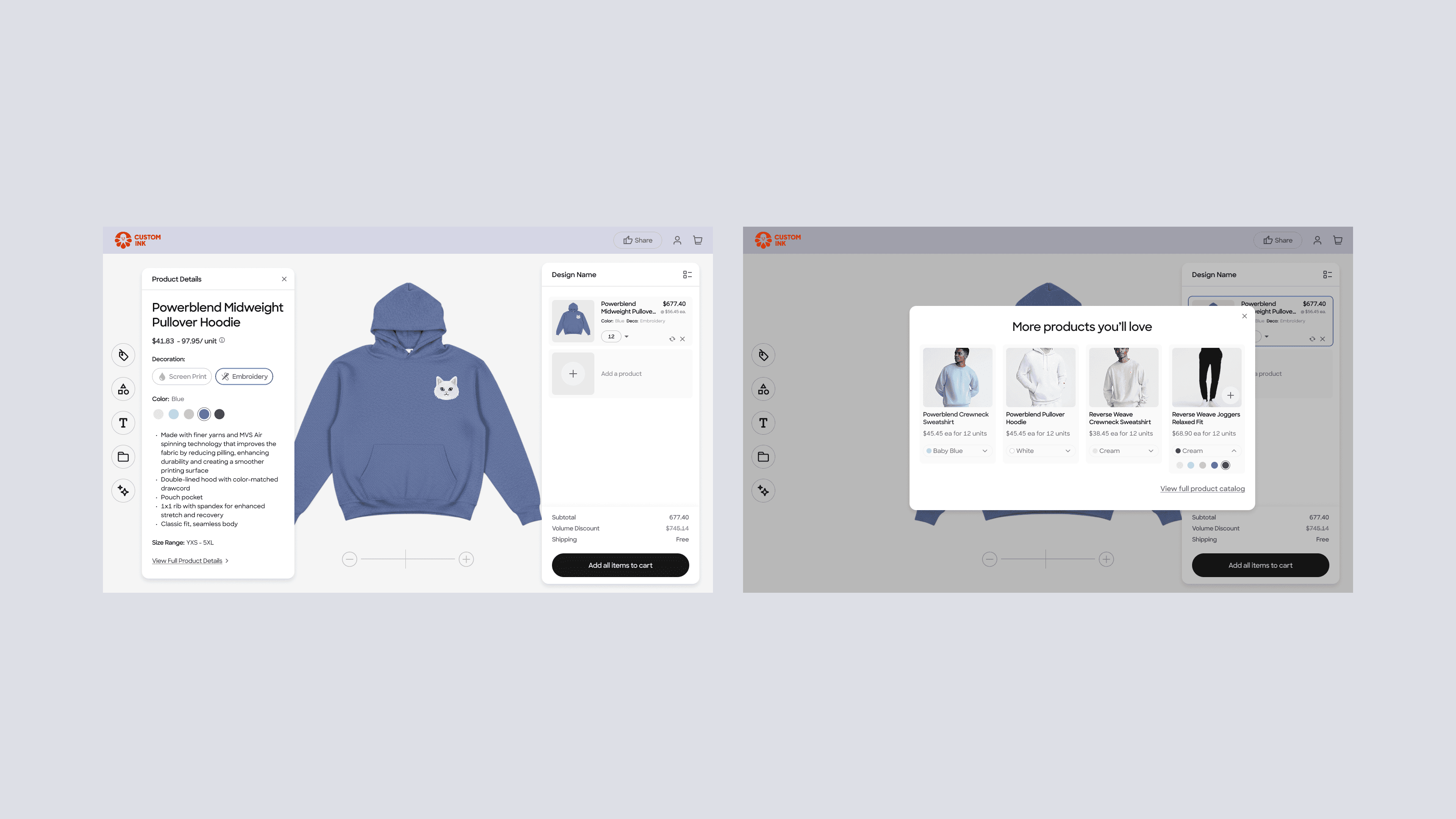
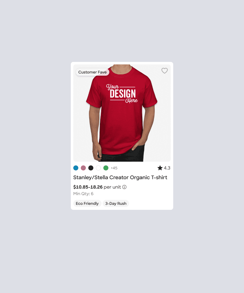
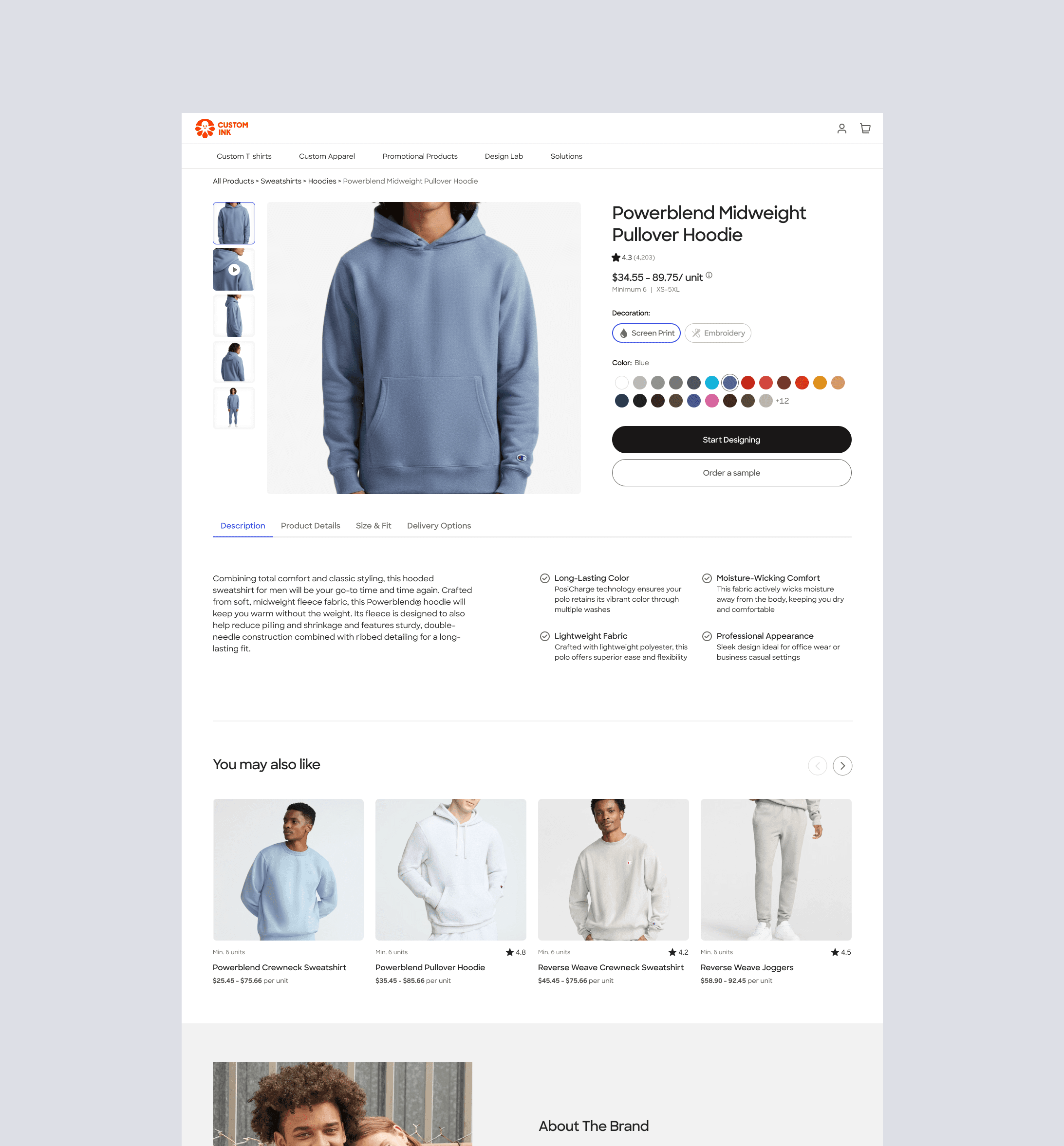

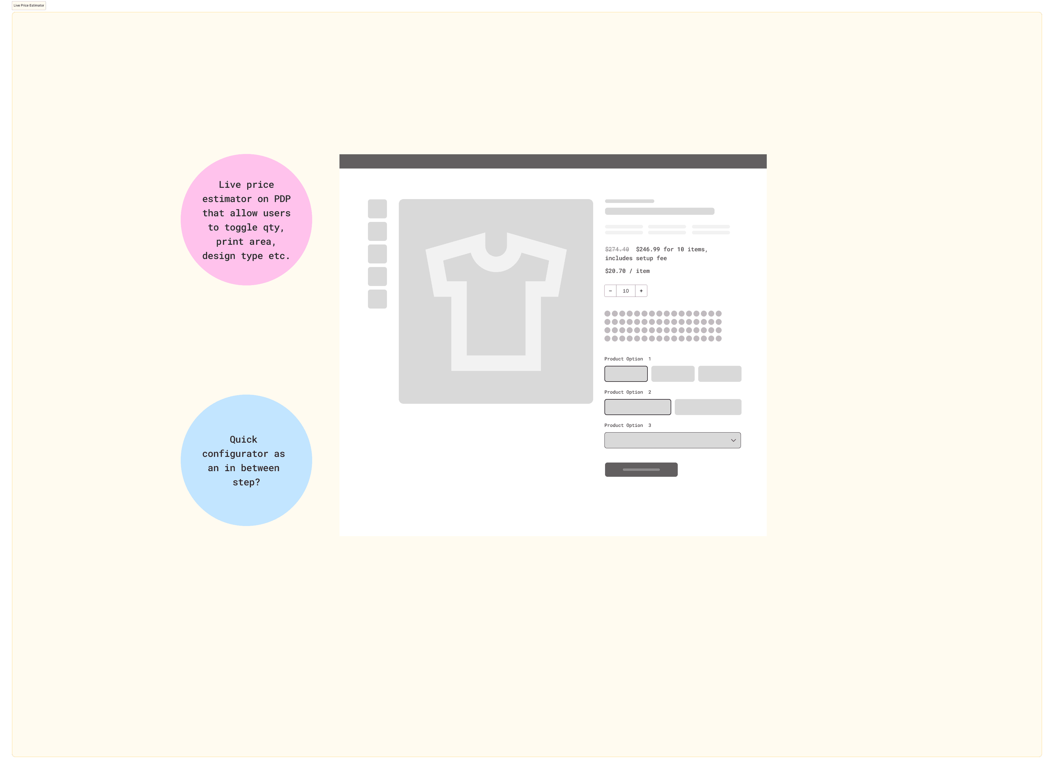
Pricing transparency: Instead of presenting updated totals, I designed surfaces that exposed the variables driving cost and made quantity-to-price relationships visible before customers committed. The goal was to make pricing feel explainable rather than arbitrary — so a price change felt like information, not a surprise.
Recommendations: The existing recommendation surface read as promotional. I redesigned the pattern to surface context — why a product was being recommended, how it compared on price, decoration options, and timeline — so customers could evaluate rather than just react.
Edge cases and failure states: A large portion of customer confusion happened outside the ideal flow — inventory constraints mid-flow, decoration conflicts, quantity thresholds triggering unexpected price jumps. I treated these not as edge cases to suppress but as core design moments. Each state was mapped and designed to feel recoverable rather than punishing.
Experimentation and Validation
I prototyped the simplified pricing flow and ran moderated usability testing against the existing experience with a focused test: do customers understand what factors impact their price?
Original flow: 85% of participants could not understand variables that impact pricing. Most participants felt that the final pricing was manipulative and included hidden fees.
Prototype: 87% of participants found the pricing structure (unit pricing, discounts, pricing variables) to be clearly laid out and easy to locate throughout the flow.
The qualitative signal was equally clear — participants described the new flow as “Very clear, concise, very well designed. No issues at all.”
Once we identified where ambiguity and uncertainty existed, we used A/B testing, funnel analysis, session recordings, and usability testing to measure whether improved clarity translated into better customer outcomes.
Rather than optimizing purely for clicks or speed, experiments focused on indicators of confidence and decision quality, including:
Reduced abandonment
Increased progression through customization flows
Improved interaction with recommendations
Faster recovery from friction states
Higher purchase intent
This created a continuous feedback loop between research, design hypotheses, implementation, and behavioral data.